Impress Property Services
Project Year: 2017
Location: Durham, England
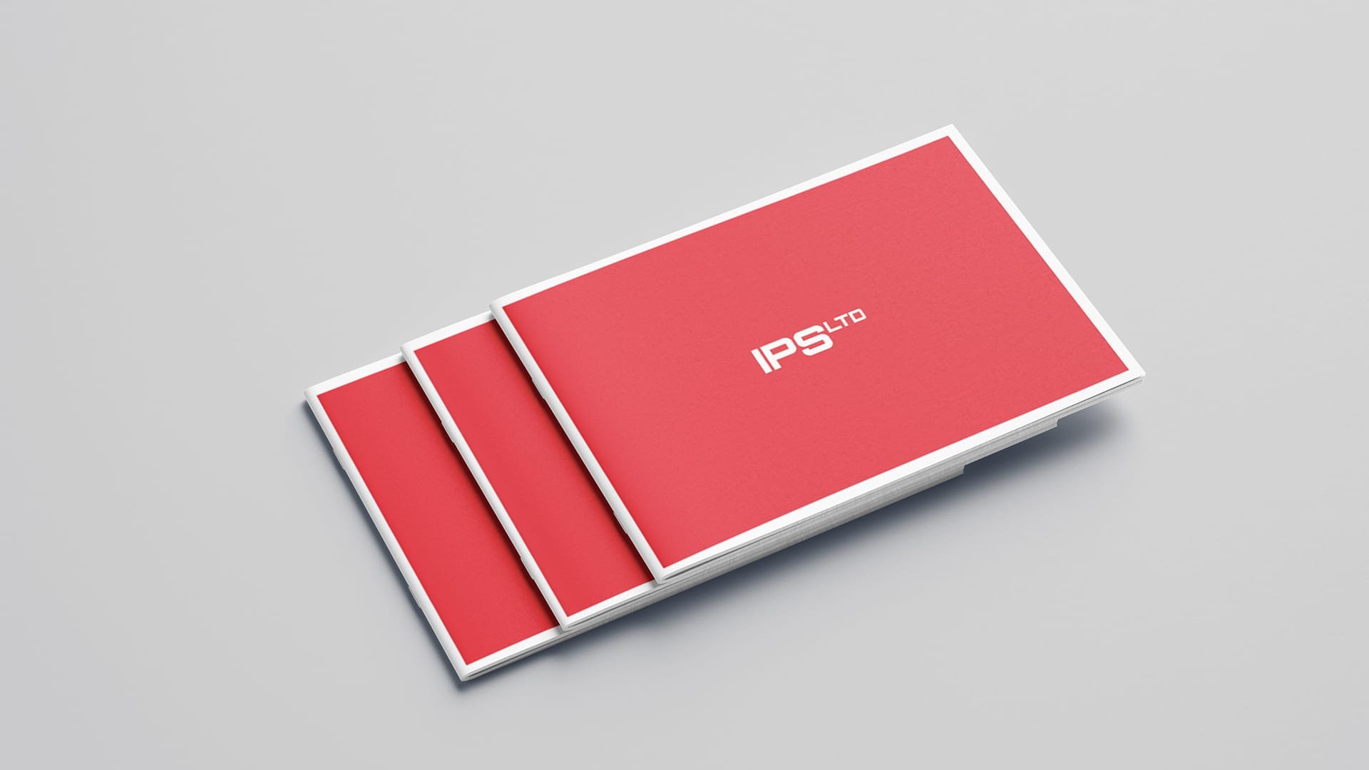
Brand refresh for North East based family-owned property services business with over 15 years of experience carrying out maintenance and building works with Supported Living Schemes, domestic building trade, and over 5 years of experience in the commercial maintenance trade.
-
The Approach
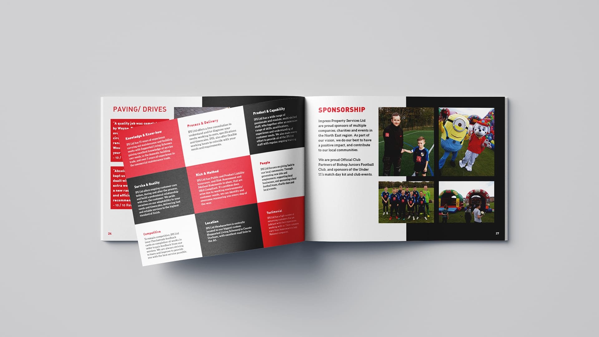
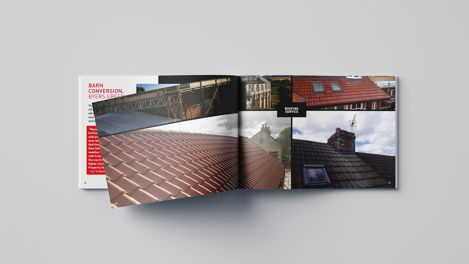
With little more than an outdated, industry cliché logo design and basic leaflets, Impress Property Services Ltd needed to revamp their branding and design system to align with their company growth and vision. We analysed the existing branding to discover how to move forward. To understand the company's position and how they portray themselves in the local competitive landscape in contrast to their competition. We delved into IPSLtd's brand story and their direction to develop the identity authentically.
The Solution
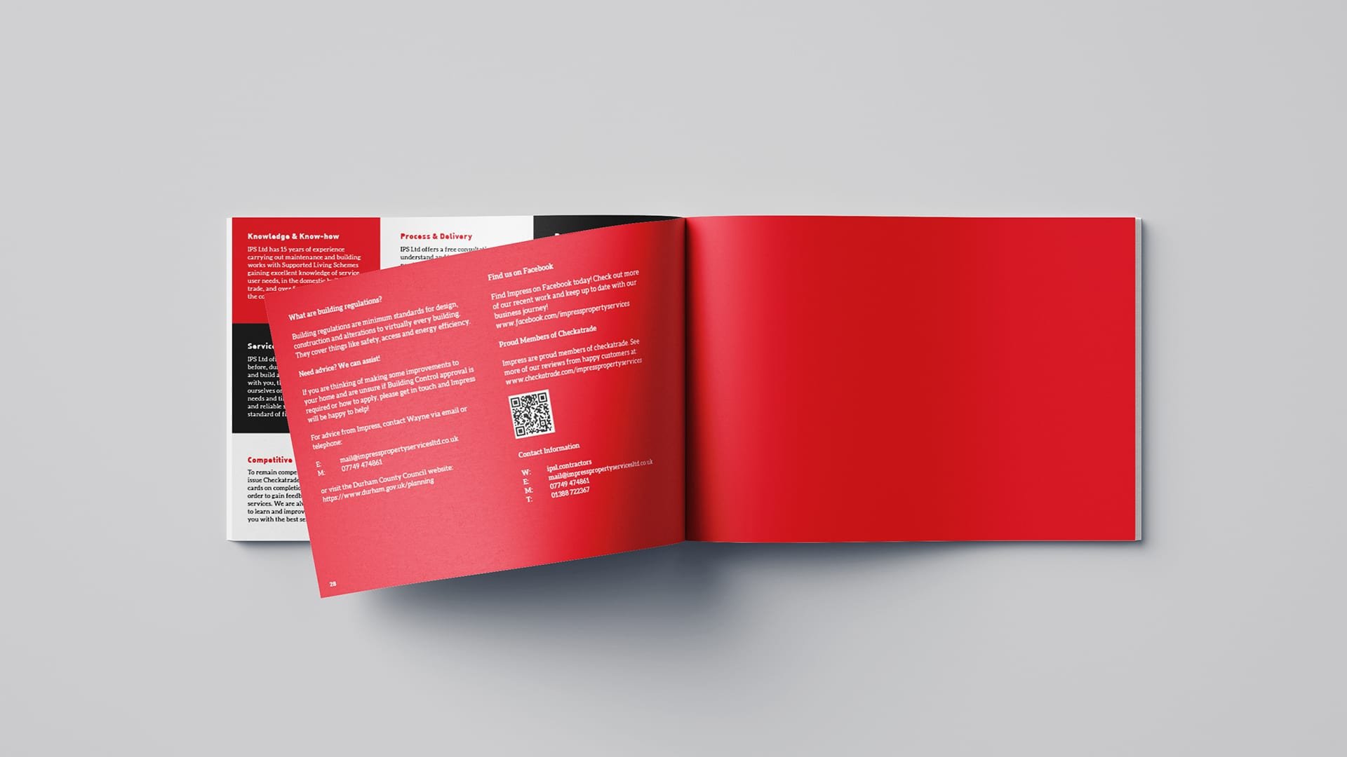
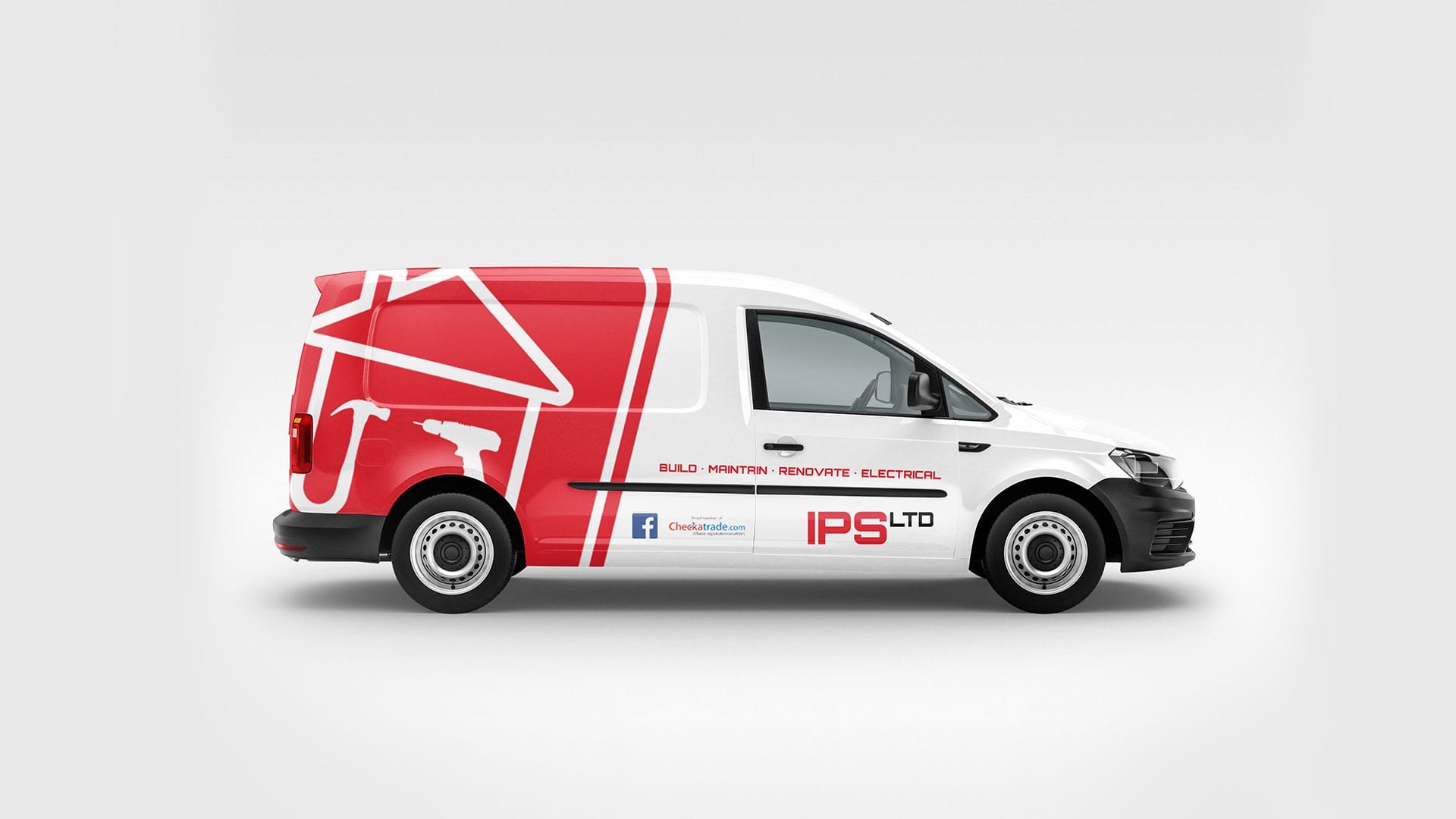
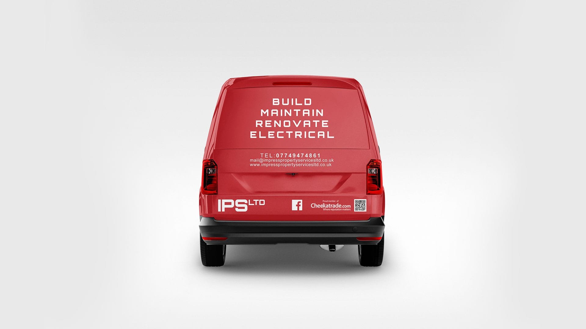
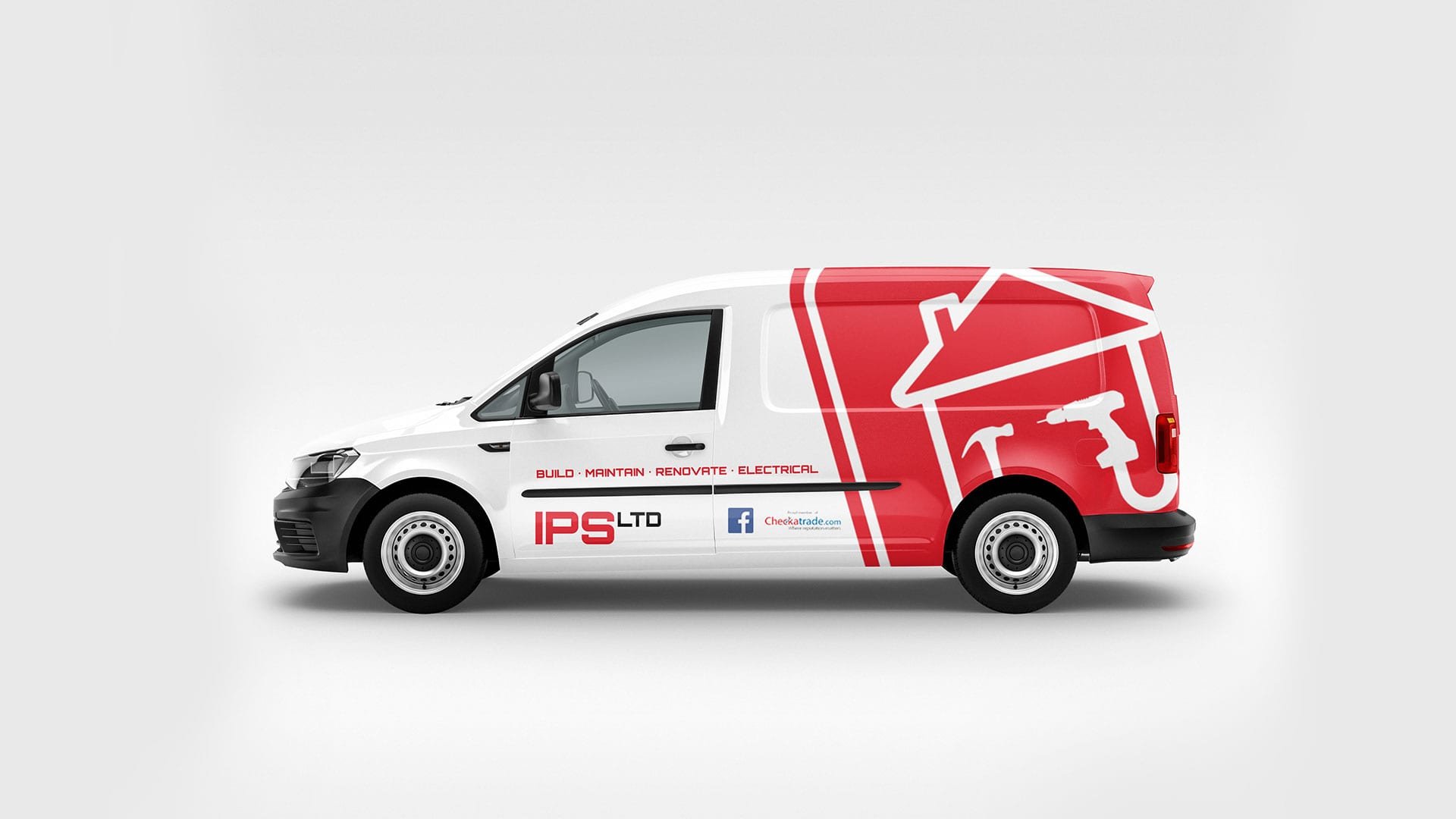
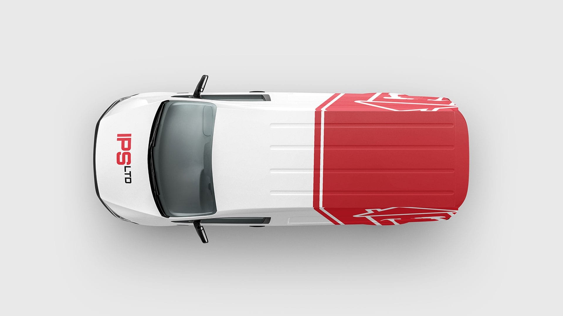
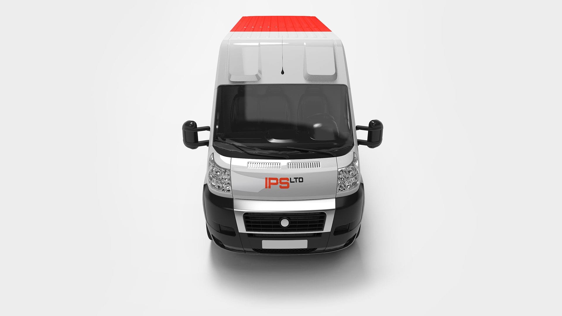
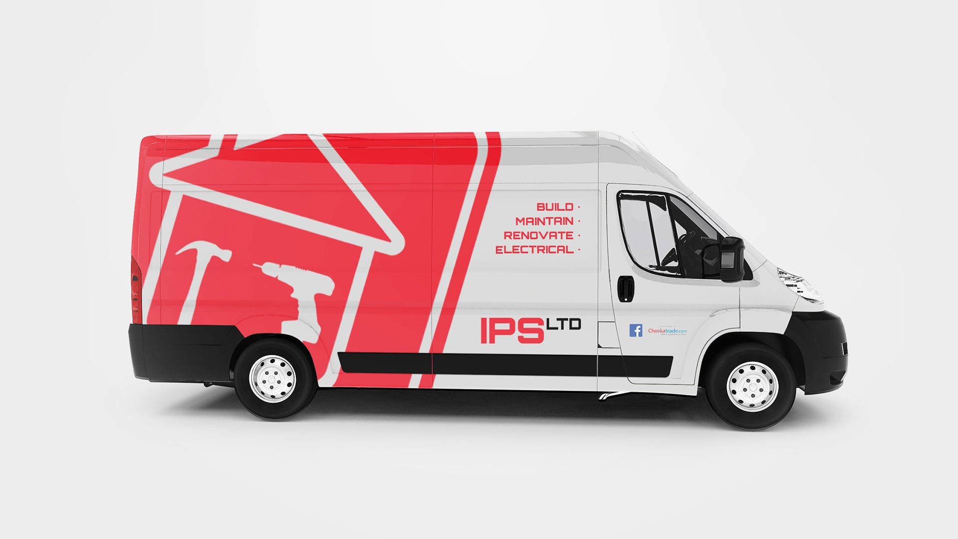
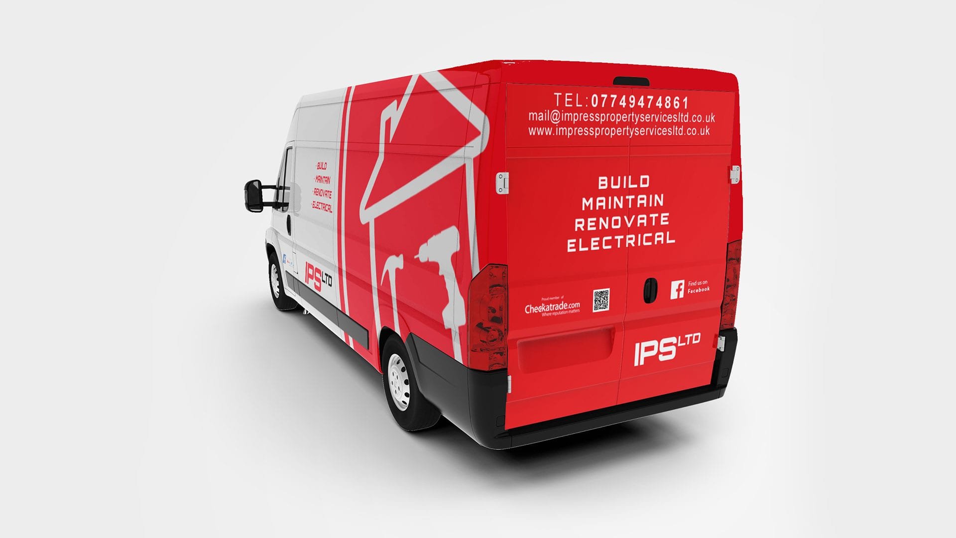
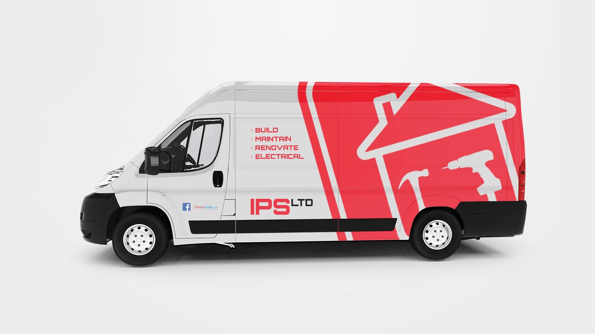
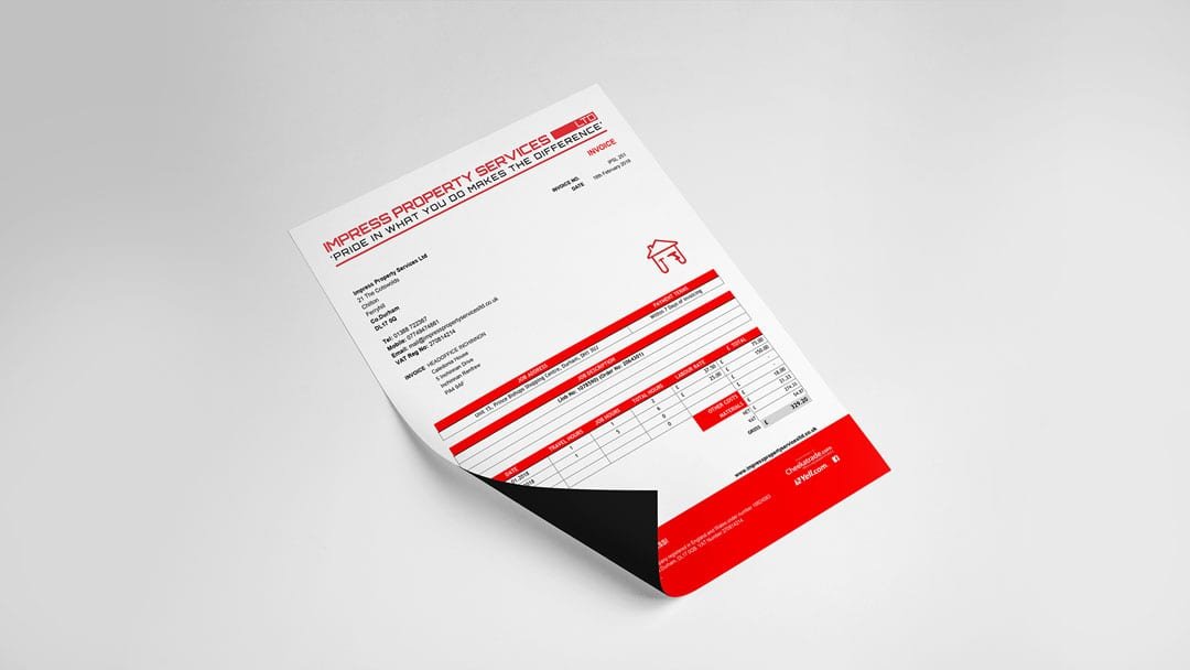
The new logo system is simpatico with the organisation's customers. The simplistic, bold system is accessible across all ages and abilities - reflective of IPSLtd's diverse customer demographics. The red and white colour palette is symbolic of strength and action and psychologically affects the audience's attention and motivation. It denotes immediacy to making their customers' vision a reality.
-
“Luke has been liaising with us over the past few months to rebrand our company. From redesign of our logo to producing a brochure to showcase our work. We are over the moon with the new design. Luke has spent many of hours revamping our letterhead, invoices, ID cards, business cards, van design, website,etc; as well as time spent setting up & submitting documents to print. It has been a pleasure to work with such a dedicated, committed individual, and we will certainly be returning in the future to help maintain our website and any other design needs.”
Wayne Cator, Managing Director at Impress Property Services


